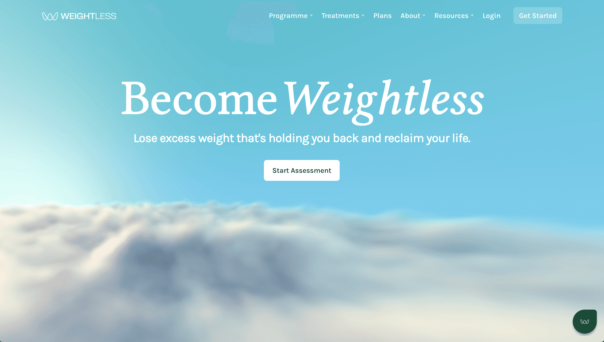

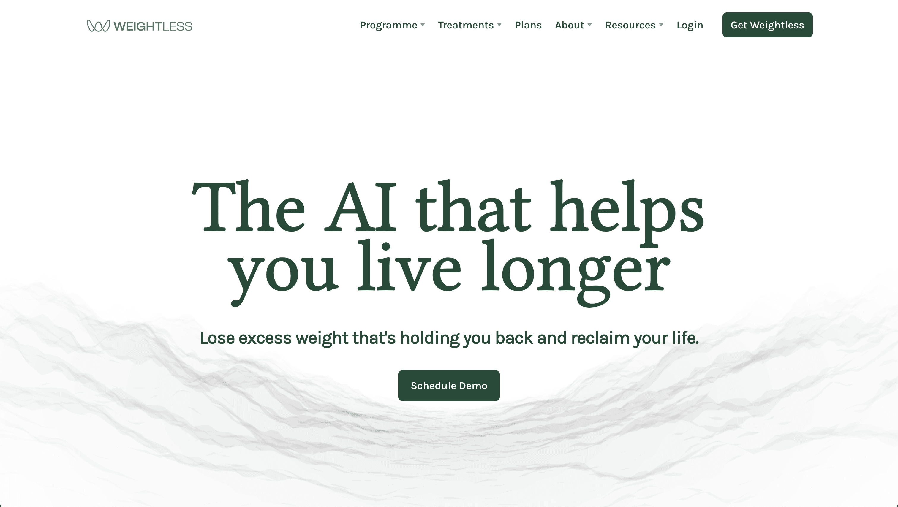
Weightless's most ambitious idea is also its hardest to explain: an AI that reads the signals from your body — wearables, labs, sensors — and turns them into timely, do-this-now nudges. We designed the landing page that makes the idea land in one scroll, for the people who matter most: patients, clinicians, and insurers.
Some products are hard to build. This one was hard to explain. "A unified health signal layer that turns biology into real-time bio-prompts" is a brilliant idea and a terrible first sentence. The team needed a page that took a complex, abstract longevity concept and made a stranger understand it — and want it — before they scrolled away.
Design the explanation. Take the loop at the heart of the product — connect signals → AI interprets → you get a bio-prompt → your response feeds back in — and build the page so the scroll teaches it. Every section earns the next. By the bottom, an abstract idea feels obvious.
- 01
The scroll as the explanation
A narrative arc that opens with a felt truth ("your body is always talking"), names the problem ("the patterns are complex"), and resolves into the product as the answer. Calm, techy, trustworthy — the visual register longevity buyers respond to.
- 02
One page, three audiences
The same page has to convince a patient, a clinician, and an insurer — three very different readers. The design holds all three without diluting any.
- 03
Consistent with the mothership
Built to sit naturally alongside the core Weightless brand, so the AI product reads as a confident extension, not a side project.
“We could never explain bio-prompting in a meeting. Now we just send the page.”
A landing page that made an abstract longevity concept legible and pitchable to patients, clinicians, and insurers alike — driving 10,000+ waitlist signups and 500+ demo bookings post-launch.
An abstract idea, made obvious in a single scroll.